Abstract
SolarWinds® Database Performance Analyzer (DPA) is a performance analysis product unlike other resource-focused health and alerting monitors; it allows a comprehensive determination of why a particular TSQL statement or stored procedure is slow or creating a performance issue. DPA achieves its performance analysis using wait-based analytics vs. resource utilization/consumption approach. By using this technology, DPA found a significant performance issue not accounted for with the comparative performance monitors: Idera® SQL Diagnostic Manager® and SentryOne® SQL Sentry®.
Overview
Third-party performance monitoring and analysis tools vary in what and how they collect and present database performance data. These applications can be categorized as Database Performance Analyzers and Database Performance Monitors. Each category has their pros and cons, and the functionalities between these two types of applications blur.
No DBA wants the dreaded 2 a.m. phone call with the other party saying that the database is slow. If these third-party tools are configured correctly, hopefully they will have already alerted the DBA, who can respond to the phone call with “I am already working on that.”
The purpose of this paper is to address the best tool to identify and help correct the offending slowness issue. It will look at the SolarWinds Database Performance Analyzer and compare it to Idera’s SQL Diagnostic Manager and SentryOne’s SQL Sentry (both of these latter tools are categorized as Database Performance Monitors).
SolarWinds Data Performance Analyzer for SQL Server®
Database Performance Analyzer is based on tying wait types and times to individual query plans, plus all the respective metadata (CPU, I/O, frequency, missing indexes, history, etc.). It then allows the analyst to drill down by date and time and/or wait type to resolve performance issues. From a technology view point, this product interests me because of its emphasis on identifying the various wait type statistics from a database and their respective metadata, and tying them to their respective query plans. After all, what is performance analysis if not reducing wait times?
After a relatively easy installation and registration of instances/databases, to bring up DPA (I’m using Microsoft Edge®), you just need to access the URL.
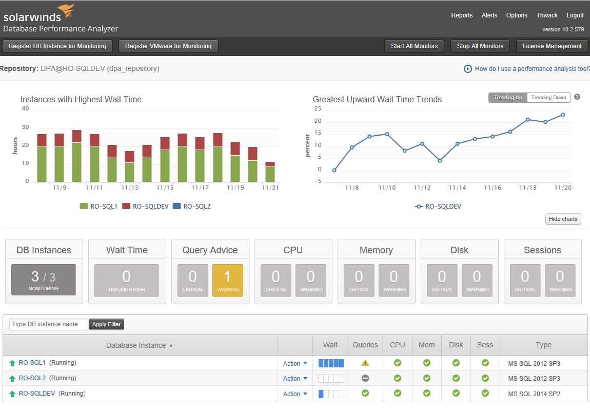
Figure 1
This shows the instances encountering the most wait times and an indication of any issues with queries, CPU, memory, disk, and locking/blocking.
Functionality & Features
The DPA home page gives overall status of each registered database server. SolarWinds recommends no more than 250 registered servers per DPA web server (guidelines for server in Administrator Guide), but can link multiple DPA web servers to give a total picture of the entire database farm. Shown below is the DPA Home page:
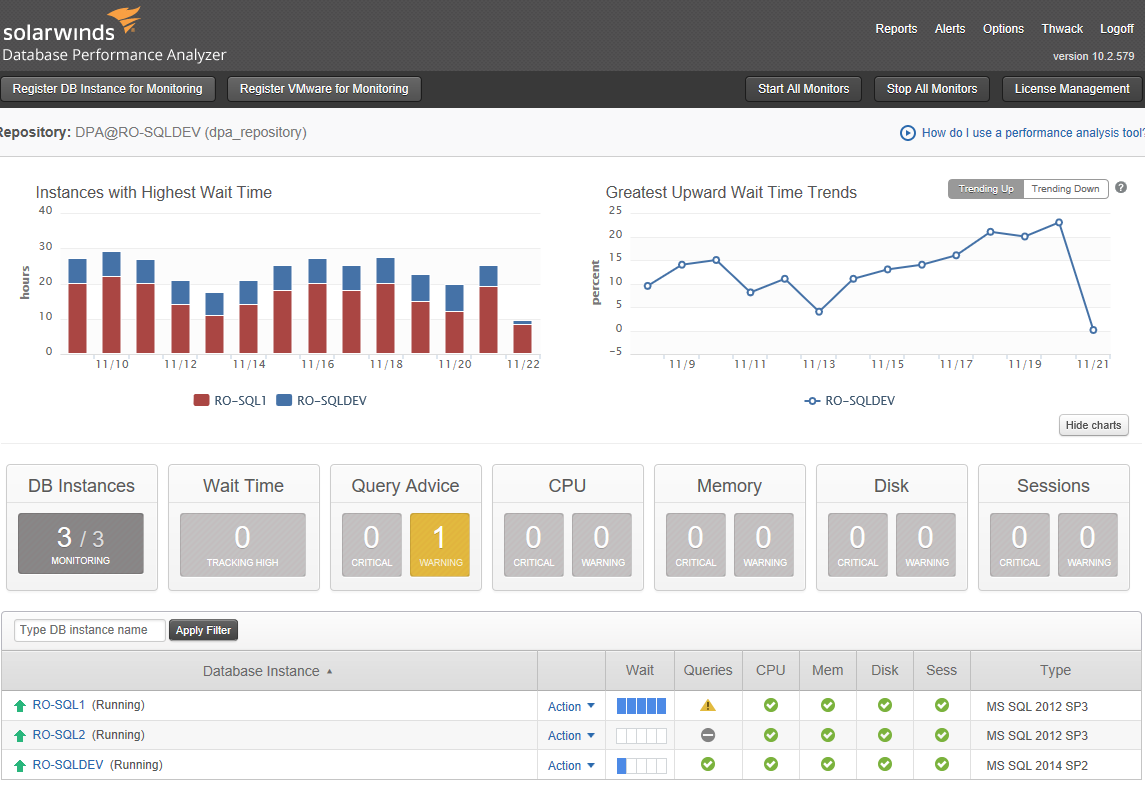
Figure 2
Clicking on the yellow warning triangle for RO-SQL1 (Running) for query advice, as shown in Figure 2, takes you to the following screen:
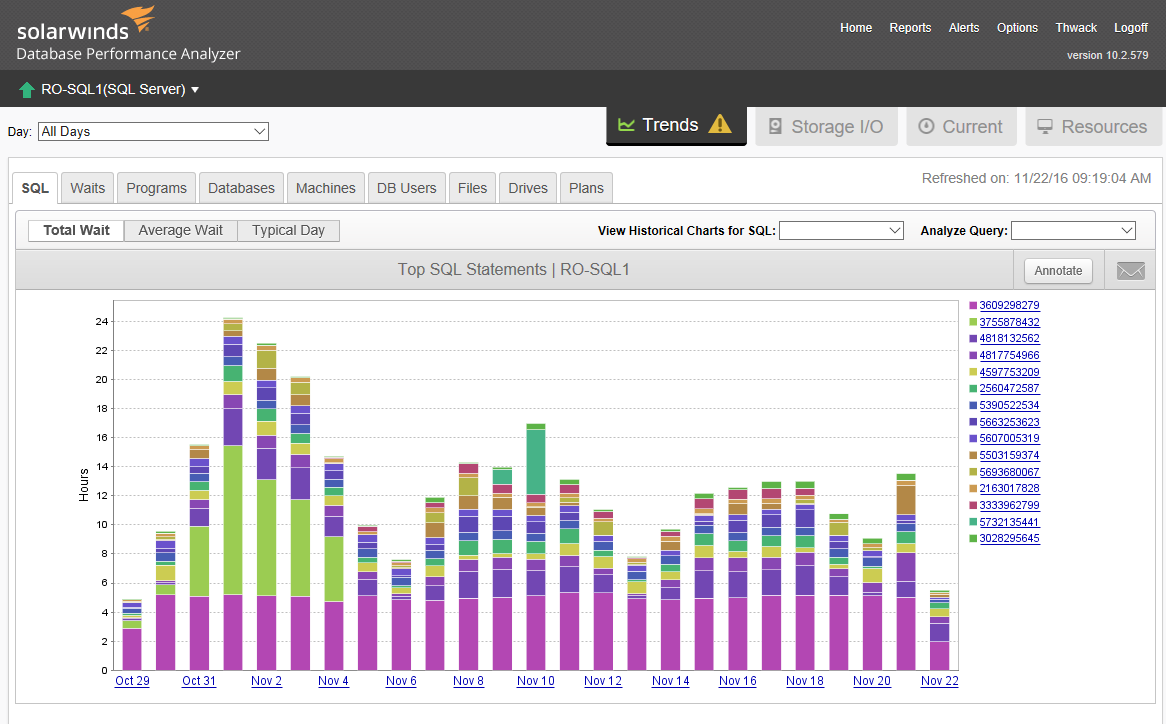
Figure 3
Figure 3 gives a historical view of wait times per query. This illustrates the power of SolarWinds DPA: the drill-down capability. If you look in the time frame Oct 31 to Nov 4, query 3755878432 (light green) dominates the total wait time amount. If you hold the cursor over one of the light green bars, you get:

Figure 4
Figure 4 shows a full explanation of what the query is, where it comes from (sproc name), and other statistics, including number of executions (notice almost 2,800 executions for the day). Note that the query takes 13 seconds on the average and ranked at taking 42% of total wait time that day. Clicking the light green bar again drills you down to an hourly summary for Nov 1 (Figure 5):

Figure 5
If I now click on “more” in the Advisor section for Query 3755878432, as seen in Figure 5, we get:
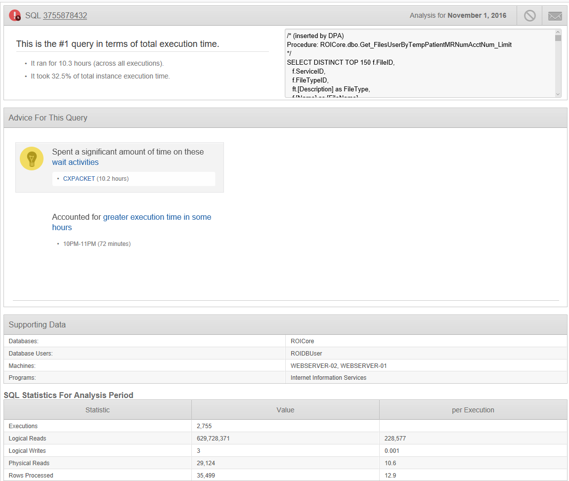
Figure 6
It is this drill-down functionality of DPA that really gives the “clue” on how to resolve performance issues. Note that for this case, CXPacket is the dominant wait. Clicking on the CXPacket hyperlink yields a modal window, as shown in 7:

Figure 7
This gives a definition of the wait type and recommendations on how to resolve.
Rewriting the query in the sproc and applying that revision on November 4 almost eliminates the waits for this particular sproc (as shown in Figure 3). This entire drill down shows the power of DPA—it rapidly identifies what is causing the slowness and possible recommendations to remedy it.
At the start of each morning, I check for any new alerts (Figure 2). Since this is a small client with only one dominant database server (database about 350GB), I tend to mainly monitor the Current screen (Figure 8):

Figure 8
This gives me (at a glance) what SQL statements are dominating the current hour, as well as a quick graphical glance at query latency, CPU utilization, page life expectancy, and disk queue length. The only functions that I think are slightly misleading are the Currently Active Sessions and the Currently Blocked Sessions blocks. These are only those sessions at the last screen refresh (default is every two minutes). You can auto refresh to get real-time or click into the sessions, where you can kill a session or view the last five minutes of activity. If you need additional info, the Resources tab yields substantial performance data as shown (Figure 9):
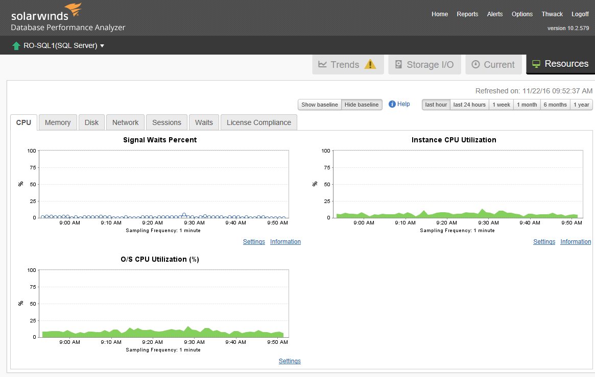
Figure 9
Notice there are also tabs for Memory, Disk, Network, etc. Notice there are also links for “Information” (helps clarify what the chart is about) and also “Settings” (allows you to alter individual default Alert settings).
You can also get to Alerts through the Options tab at the top of all screens (Figure 9). No alerts are pre-configured; you need to make your own. But an Alert Wizard gives you ample opportunity for additional configuring, administering, and additional support utilities and resources. There is also the capability to define custom alerts (even through a query to the database or a DMV). This custom alert feature gives the DBA complete control over what is happening in their databases and servers. Each alert can be configured by machine, alert level and who gets the email as well as adding custom text within the email. While the power to define an alert is strong, there is no capability to ascertain what resources (queries, stored procedure, etc.) caused the alert. You would have to drill down in the DPA interface to determine what query/condition caused the alert to fire at that time.
There are also default reports configured for each registered server (Top SQL and Top Waits) that can be custom configured (including new reports) and custom scheduled for email. Setting up custom reports is almost trivial – the screens walk you through them as well as giving you a preview before saving.
Alerts and reports can be sent to any device (including mobile devices) that can understand SNMP and other alerting monitoring applications.

Figure 10
Since DPA’s performance analysis is based on wait types, they’ve added a wait type category of Memory/CPU wait. This is not a real SQL Server Wait Type, but represents the user wait time when the query is accumulating cpu cycles or in the cpu queue (service time). This accounts for the additional time to actually execute the query and needs to be accounted for because it is a wait from an end user perspective. High Memory/CPU waits tend to occur when a query has large intermediate results and/or poor performance.
I did not notice any decrement on production server performance. DPA was doing an inquiry every 1 second (monitored by SQL Profiler), but no measureable effect.
Impressions:
I had been exposed to Ignite (now DPA) several years ago, but was a glancing exposure and I really didn’t get into it. However, this time I really had the chance to explore all facets of DPA, and I am impressed. The Wait-type analytics with drill-down really gave me increased insight to what was really going on in my client’s database. As I said earlier I thought I had it in fairly good shape performance-wise, but the graphical pictures and drill-down gave me the rest of the story. My client is happy and so far I have avoided the dreaded 2 a.m. phone calls.
Comparing DPA to Performance Monitoring tools
I selected Idera’s Diagnostic Manager (DM) and Sentry One’s SQL Sentry as being representative of the Performance Monitoring applications that are often compared with DPA. They start with a server health metrics perspective, not from a performance and wait time analytics perspective like DPA.
Idera’s Diagnostic Manager
After a thorough exploration of DM, I came to realize that it was more of an Alert Manager with additional functionality for reporting and performance analysis. On the performance analysis side, DM leans heavily on monitoring CPU time and IO statistics with drill down by date and time. Wait Types are available but not at the query level.
I categorize DM as more of a Performance Monitor than a Performance Analyzer. It is very good in this respect with many options on alert configuration and reporting (including reports to special users and groups).
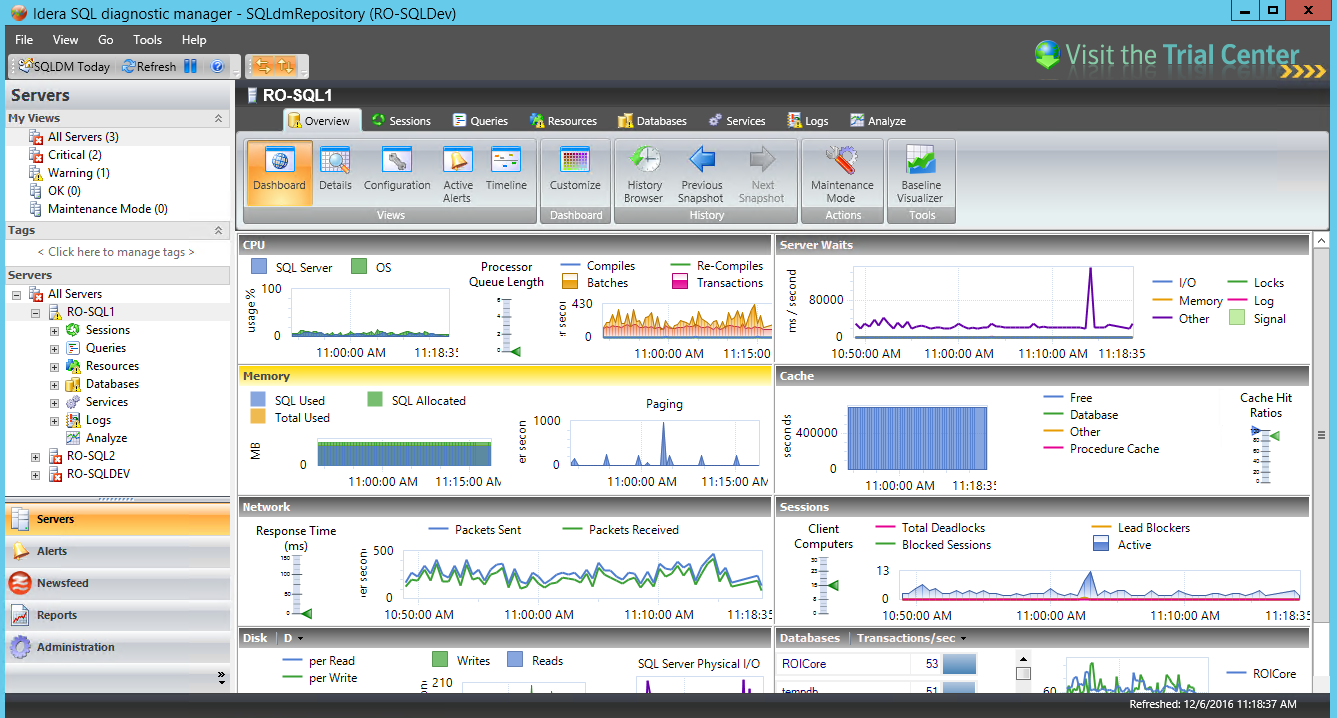
Figure 11
This screen reminds me of the primary home screen for Spotlight for SQL Server (Figure 11) with details on key performance attributes of the server. This screen can also be custom configured to display other parameters as needed. While it is a busy screen; if an Alert pops up I can easily look to see where the problem may lie. You can also add Baseline values for all the parameters, but to me, it just adds complexity.
But the one functionality I really wanted to explore was how DM could be used for performance analysis. So, from the specific server and selecting Queries (top middle of screen, from Overview tab) we get Figure 12:
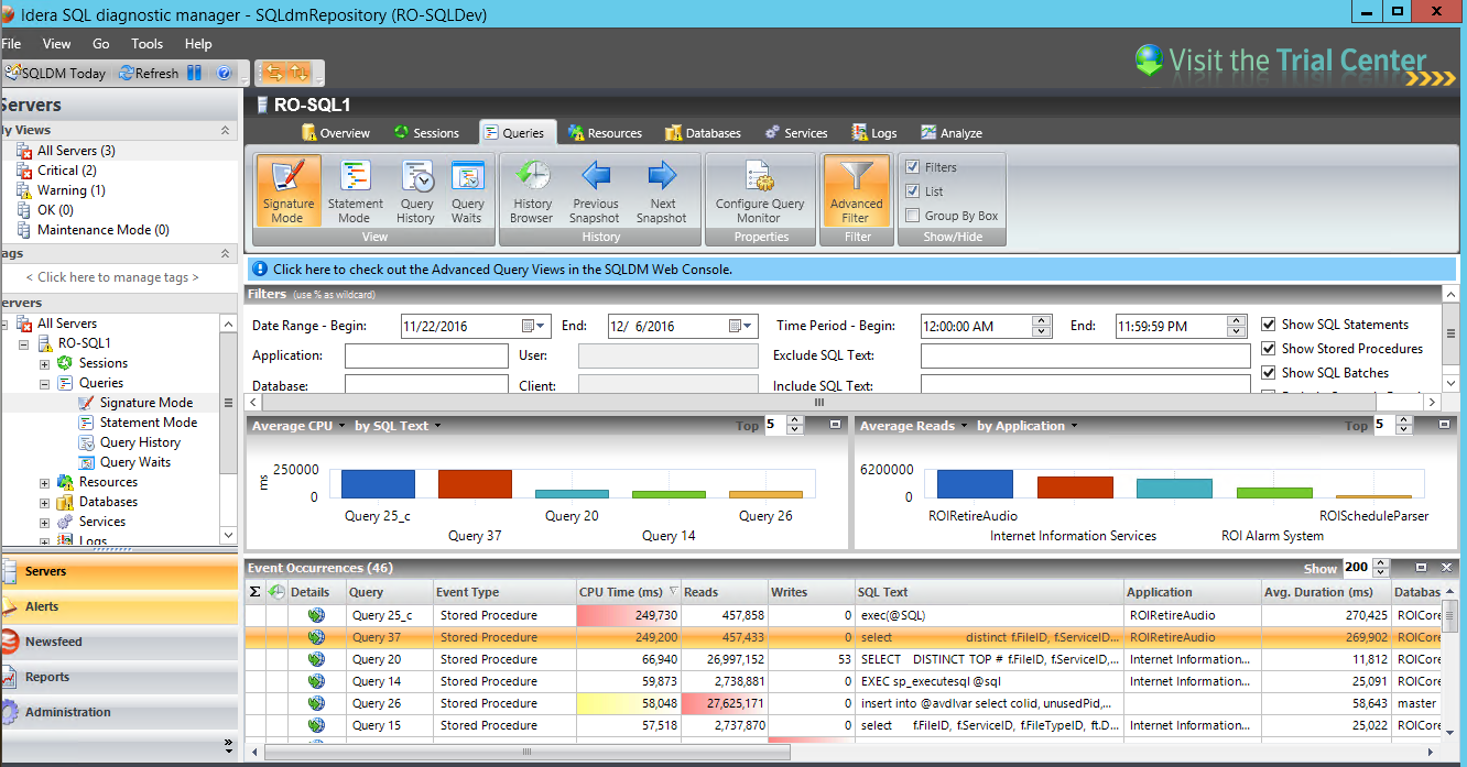
Figure 12
Notice that the queries are sorted by CPU Time (descending) and can also be sorted by Reads or Writes. But also notice that the parent stored procedure (for the TSQL statement) is not identified. This especially makes it difficult to identify the stored procedure from which the TSQL resides. Another “missing ingredient” is the frequency of calling the statement as well as any wait types/times accumulated for that specific statement. The performance data at the bottom of this screen is very similar in content and informational value as any of the various “Get TOP 50 Worse Performing Queries” scripts out there on Google®. Wait Type/Duration/Time is available in-total for database/server, just not for the individual queries.
Going back to Figure 12 and clicking the Analyze tab you get:

Figure 13
The two tabs Analyze and Run Work Load Analysis yield different results. Work Load Analysis looks at the queries running at that time and analyzes possible performance improvements. Unfortunately, in several cases it doesn’t identify the respective query to match the recommendation. If you click the Run Analysis tab, you get more of a SQL Server health check with recommendations like as shown in Figure 14:

Figure 14
This is a very good tool for managing alerts especially when on a large database server farm. Its alert capability should keep most DBAs knowledgeable of what’s happening in their domain. It has the capability to identify poorly performing queries, but is not as strong as DPA in ascertaining why the queries are poorly performing and where they are coming from. It also does not show an aggregate summary of query plans and their respective wait time – this misses the case where a query may be performing relatively quickly, but if called 1000 times every 10 minutes does not show that particular query plan as being a possible party to overall database slowness.
Sentry One SQL Sentry
Install and database registration of SQL Sentry was trivial. SQL Sentry uses a client for the interface between the user and data presented. It can be allocated to specific groups each with their own access restrictions. The initial client start page shows:
Figure 15
Note the icons just under the Start Page tab (Figure 15). These icons represent “View Performance Stats for all Servers”, “View Calendars for failures and Long Running Events for all Servers”, “Add Target”, “Add User”, “System Status”, and “Actions Log”. There is also a drop-down box to look at data for last 24 hours or smaller time spans. Selecting the “View Performance Stats…” icon yields:

Figure 16
A parameterized metric portrayal of all registered servers. Looking at the left side of the screen under Navigation and right mouse selection of the server and then Open, you can then select Performance Analysis:
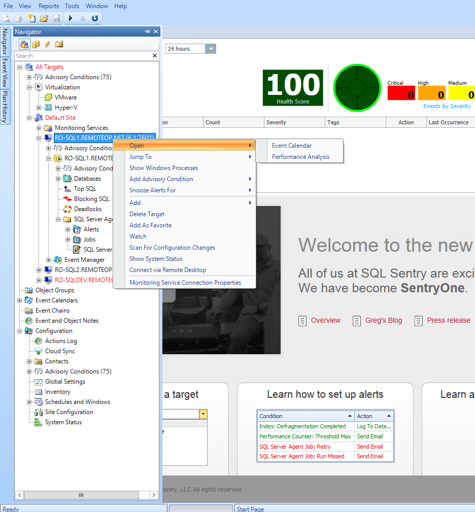
Figure 17
Selecting Performance Analysis yields a dashboard (but with even more data on it than DM):

Figure 18
While initially I thought this dashboard (Figure 18) was a little busy, after some familiarization I found it to be useful for seeing what was going on at current time (can also be used for historical time periods) on the DB server. Note that on the dashboard you can left click a time on any of the graphs and a red line will appear on all the graphs at that same time. A nice feature (I found) was the small alert triangles displayed. Left clicking on the yellow triangle in the CPU usage box yield a popup showing:

Figure 19
This is a condition I had been trying to explain to one of my clients with little avail. SQL Sentry not only found it, but explains it in layman terms. The other two warning triangles are tracking long running transactions. Neither of these conditions are causing an immediate performance issue, but gives indication of a pending problematic issue.
The rest of the tabs of the dashboard screen are needed for performance analysis. The Top SQL tab shows the longest running TSQL during the time period. Highlighting the specific TSQL code also yields the actual parameters from that specific event.
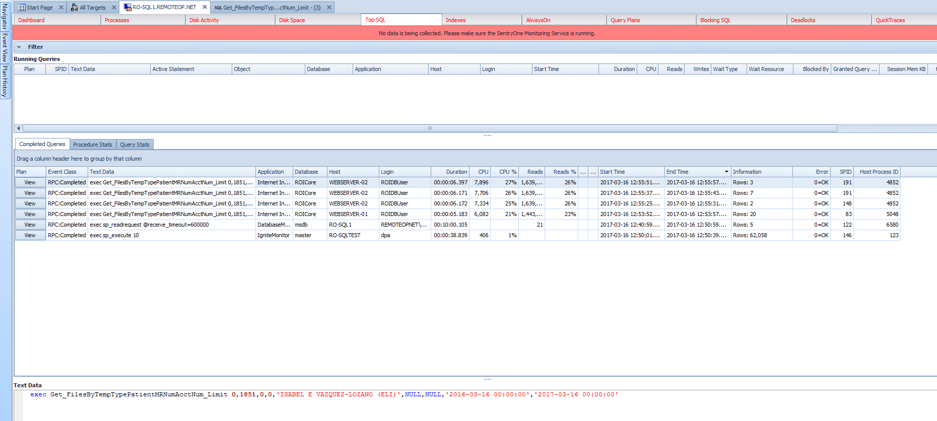
Figure 20
Please note that SQL Sentry has identified individual TSQL statements with longer than normal CPU durations (resource identification). Selecting View (for the top line under Plan) launches Plan Explorer and yields
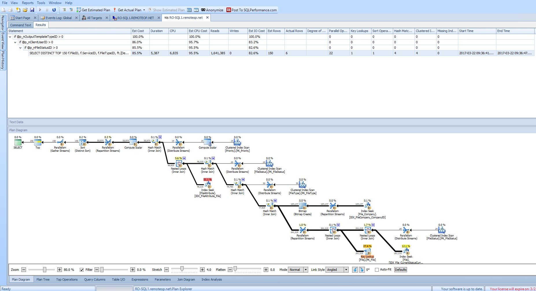
Figure 21
Plan Explorer Pro is built into SQL Sentry; this is probably one of the best visualization tools for query plans available. It is also available free as a plug-in for SQL Server Management Studio (SSMS). Note that it highlights objects using a fair amount of resources. Note the highlighted Index seek on dbo.FileAttribute. The reason for its high cost is in the queries WHERE clause where they are several OR clauses combined with a text search LIKE clause. Also note the Key Lookup on PK_File. Normally you resolve a key lookup object with a covering index, but in this case most of the columns of dbo.File are in the result set and if you covered the index you would almost recreate dbo.File sorted on CurrentStatusID. The existing index is already large (in width) and does not need additional columns.
As per all of the Performance Monitors SQL Sentry comes with many pre-configured alerts and reports. Both the alerts and reports can be individually tweaked as well as sent to specified users.
SQL Sentry is a very good tool for performance monitoring; once I mastered the Dashboard I could easily spot potential issues as they were forming. It also has the capability to identify poorly performing queries especially when drilling down to Plan Explorer, but still is not as strong as DPA in ascertaining why the queries are poorly performing and where they are coming from. It also does not show an aggregate summary of query plans and their respective wait time as discussed earlier for DM.
Choosing the right tool:
As you may tell I really do like the DPA approach to performance analysis. The wait-type analysis structure just gets you down to the nitty-gritty. It quickly identifies which queries are performing poorly and provides good indicators of why they are performing poorly. I wish I had found this product years ago.
DM and SQL Sentry, on the other hand, have a rich library of alerts and reports. They perform quite well in the performance monitoring role and also identify most poorly performing queries – but without the detailed analysis that DPA gives and only from a CPU or IO ranking. Neither product will rewrite your queries for you, but each has its strengths.
As a test to see if DM would identify a poorly performing query identified by DPA, relook at Figure 3, query 3609298279 (light purple at bottom of graph). This query was identified as coming from Get_HL7SystemAttributesBy HL7System and primarily causing most wait time because of frequency of executions and large number of IOs. This particular query did not show up in DM or SQL Sentry. Not that this is wrong, but the resource consumption approach does not give the same qualitative results that the wait type tied to query plans technology. From the user viewpoint, wait time total is the major irritant; nobody has ever complained that the database is too fast.
From my point of view, DPA is much more capable for Performance Analysis. It gives you not only the poorly performing queries, but their stored procedure names if applicable, execution frequency, and number of IOs. Scoring the two against each other from a Performance Analysis viewpoint I would give DPA an 8 (it didn’t rewrite the query for me) SQL Sentry (with the built-in Plan Explorer) a 5 and DM a 4.
DPA, DM and SQL Sentry all have the performance monitor function. DM comes with many more built-in alerts (out of the box) and reports, but all allow the user to customize additional alerts and reports. SQL Sentry in my opinion just has a better way of displaying current and past performance of the Database server. This is very dependent on the DBA maintaining the DB servers and is more taste than objectivity.
If you are looking for a database server performance monitor, health and alert-oriented tools like Idera’s DM or SQL Sentry (or SolarWinds’ own SAM) may be the right choice.
On the other hand, if you are looking at performance analysis to understand what is causing performance issues and how to solve them, then DPA is a clear choice.
By Mike Byrd
Senior Database Engineer
ByrdNest Consulting
————————————————————————————————————————————————————————————————————————————–
Download your free trial of DPA today!
Leave a Reply